Jul 25, 2011

Color
is a temperamental beast!


1945 - 2010
Bard Graduate Center Exhibition
May 18 - July 31, 2011

                             EVE ASHCRAFT              MATTHEW GOODRICH          ELIZABETH DOW


The Gestalt of COLOR
Moderated by Rebecca Allan
Bard Graduate Center Forum

Yes, I did have to google gestalt.  Even though Rebecca Allan, Head of the Education Department at the Bard Graduate Center did try to define the word at the beginning of her remarks, I just wanted to make sure I got it right.

GESTALT...is a psychology term which means "unified whole".  It refers to theories of visual perception developed by German psychologists in the 1920's.  These theories attempt to describe how people tend to organize visual elements into groups or unified wholes when certain principles are applied.

And for once the title of a program actually made sense.  Three designers (Ashcraft, Goodrich, Dow) did talk about the power of color to define form, illuminate space and reflect light.

These are the people who know people.
These are the names in small print at the back of the magazine.
These are three creators who think and see.

ELIZABETH DOW makes things... made by hand... in America...with Americans.  These things take the form of wall coverings, both custom and stocked.  Using some traditional techniques, like combing, Dow creates pieces that are have the feel of paintings.  Each panel slightly different from the next.  Each color-way UNIQUE. 

If you want to see a sample of her work go to the Oval Office.  One of Obama's requirements for interior furnishings at the White House was that they be made in America by Americans. 

In a very matter of fact way, Elizabeth Dow showed slide after slide of artists who had influenced her work.  I could appreciate her desire to transform or translate a Morris Louis trademark: the soak and stain technique into a wall covering.  Her work is as close as one can get to the real thing: something hand-painted by an artist.

EVE ASHCRAFT is known as a master colorist.  She is the person that helps clients and corporations develop color for residences or in the case of Martha Stewart a line of paints. 

Like Elizabeth, Eve also talked about her inspirations.  A door in her neighborhood...a metrocard...a bus ticket.  In my collecting days, I also saved tickets of all kinds for the graphics or color.  Eve described how ephemera provide a resource for her color exploration.  "The more you collect, the more you see.  These things remind you of the moments when you understood something."


EXPERIMENTS WITH COLOR:  Playing with discordant colors - Eve Ashcraft's studio.

Eve Ashcraft has a new book coming out, The Right Color and a line of 28 paints produced by Fine Paints of Europe.  For each color she created a portrait.  It's an interesting way to think about color as having a personality.

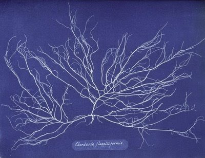
MATTHEW GOODRICH is a design strategist.  He works for the Rockwell group putting together (from what I could gather) color palettes and color inspiration.  For example, after some research he found these cyanotypes by Anna Atkins, a Victorian botanist and used them as inspiration for the color palette at  a condo in Florida.
Someone in the audience asked all three designers if they had any qualms about  making their services available only to high-end clients.  Goodrich jumped in and answered the question.  "Color is affordable.  It filters down.  Everyone can have color". 

________________________________________
Eve Ashcraft is an architectural color consultant
http://eveashcraftstudio.com
Elizabeth Dow is a designer of fine wall covernings
http://www.elizabethdow.com
and the director of Applied Arts School for the Arts in Amagansett

Matthew Goodrich is a design strategist and interior designer at Rockwell Group
www.rockwellgroup.com
Rebecca Allan is a painter and the head of education at Bard Graduate Center.

Jul 23, 2011

Tulipomania 2011
Julian Faulhaber

Julian Faulhaber
Bloom and Bust in the Netherlands
Hasted Kraeutler Gallery
This isn't an Agnes Martin  painting, it's a photograph by Julian Faulhaber of the tulip industry in the Netherlands.  On a really hot day in Manhattan go down to 24 Street  and cool off inside the Hasted Kraeutler Gallery.  I love these photos because they show us another way of looking at one of most cliched images (the tulip) in photography and painting.


Here are some facts from
 New York Times:
Number of tulips bulbs produced annually in the Netherlands: 
3 Billion
Number of cut tulips exported annually:  2 billion
Number of registered varieties of tulips: 3,000
Rank of tulip among flowers in worldwide popularity:  No. 3

Jul 19, 2011

Visible and Understandable
NIPPaysage

Place de l'Acadie, Montreal
Some people never get tried of working alone.  I am not one of those people.  As a garden designer, collaboration with clients is usual, but not collaboration with other designers.   The collective nature of work, in general, is of interest to me.  NIPPaysage is a landscape architecture firm out of Montreal  I wanted to know more about.   Especially because of its shared synergy.  Mathieu Casavant was kind enough to answer a few questions.

PO:  I read on your website that NIPPaysage consider themselves a "new wave of landscape architects."  In what way?  How would you define the previous profession of landscape architects?

MC:  Good question!  After working for a couple of years with well-established firms in the US, we decided to establish our own practice back in Montreal, which was kind of gutsy considering we didn't have much experience or know the local market. 

Montreal is trying to define itself as a design city, but there are only a few new landscape architecture firms that have started up since we graduated...back in 1998!  It is sad to say we can probably count on the fingers of one hand how many have survived and still offer fresh and inspired work.
Le Bon Arbre Au Bon Endroit
Jardin Metis, Canada
A temporary garden presented in collaboration with Hydro-Quebec for the Metis Internatinal Garden Festival.  Le bon arbre au bon endroit reminds us that planting the right tree in the right place makes good sense.  Above. thousands of birds perched on dozens of cables surround he garden.  On the ground, the project has evolved over a three year period:  2008-wire reel garden, 2009-hammock garden and 2010-giant picnic table garden.


So I guess that even after 10 years, we still offer something new because more established firms have to keep ourselves exposed to new challenges and not repeat ourselves, which means we are always discovering new aspects of the profession.  This keeps the energy level up and things never get dull or predictable. 

Currently, we are simultaneously working on a temporary urban art piece (paint job) for a downtown plaza, the delicate restoration of the cross on the summit of historic Mount-Royal and a large brand new mixed use development for 10,000 people near Delhi (India).

Dealing with the various scales, realities and contexts is really exciting and allows us to avoid niche-based recipes.  We want to integrate sustainability components in our work, not only in a functional way, but in expressive ways, as a design starting point, like for example in "Place de l'Acadie" Park.

PO:  Can you elaborate on your process?  How does the  collaborative approach work.  How do you reach consensus?

MC: Over the years, I think our process has evolved to become more effective, but in general it remains a highly collaborative effort. 

We generally begin by talking and sketching about a new project.  This setting is ideal because it is improvised, people are generally relaxed and it allows us to consider the job without spending too much time analyzing the site survey or the detailed program. 


This is an opportunity to express whatever is on our mind, whether a large site consideration or a specific detail or material that seems appropriate.

Surprisingly, our discussions almost never involve negotiation or heavy compromise.  There is a strong belief that the best possible idea will feel "right" to everybody around the table...if someone is uncertain, we'll usually change the whole design orientation until we all feel it is "the one".  The basic respect and appreciation between all of us is really what guides the discussion.  If an idea is not good enough for one of us, it's probably not good enough for NIP, so we are happy to explore other directions.

Paysage Lumineux, Public Market
Boucherville, Quebec, Canada
Design and conception of art work for the new market building.  On an angular steel structure, 700 colorful jars create a canvas of the regional pastoral landscape inspired by the popular game 'Lite Brite' to represent agricultural patterns of the region

We also take pleasure superimposing anyone's lines to a drawing.  Once the design orientation has been established, someone will become the project manager and supervise its evolution from original sketch to real job!


PO:  What do you consider the areas you have the most interest in? 

MC:  We are passionate about the jobs that allow us to study and express beauty of a site, even if it has a reputation of being forgotten, ugly or useless.  Of course, we have been integrating sustainability as a large aspect of our work, but the focus remains the way people use and perceive a place...We want people to get excited about the space, to wonder what has happened here, what is going on...

We are firm believers that our work as landscape architects must be visible and understandable from the public's point of view...we are not interested in smudging the difference between nature and artifice, we want to highlight the difference!  We want to create projects that offer a new experience to the visitor, spaces that challenge perceptions and senses.


Jul 6, 2011

REVEALING
The Once Invisible:
Noli Tangere

TERRAGRAM TEAM:
Vladimir Sitta, Anita Madura and Richard Faber
Jardins de metis 2011 competition winner

I want to go to Jardins de metis.  I say that every year.  And with every new year of competition winners, I am more convinced than ever, that a trip is necessary.  I was particularly captivated by the Terragrams 2011 winning design:  Noli Tangere It's landscape design that turns our way of thinking inside out or makes the invisible visible. 
Anita Madura was kind of enough to answer a few questions about the project.
"Vladmir Sitta started his professional life in then communist Czechoslovakia.  Despite a number of competition successes and completed projects, he set himself adrift, landing in Australia via West Germany.  Terragram came about as a result of a series of coincidences - almost accidentally.  The impetus was a winning entry in a Battle of Vinegar Hill Competition in 1985. 

Terragram's portfolio is diverse from theme parks, environmental sculptures, furniture, stage design to parks and gardens.  Driven by an obsession to escape cliches, Terragram has gained an international reputation for innovation and technical experimentation.  Terragram's projects have been featured in more than 40 books and 2 monographs - 'Transforming Uncommon Ground' by T. Macgowan and 'Room 4.1.3 - Innovations in Landscape Architecture' by R. Weller.  Terragram's projects have also been televised by Arte Television and the BBC.

PO:  Why did you apply for Jardin des metis competition?
Upon Vladmir's return from a month in Europe, there was a lull in the studio.  The idea of creating a secret garden (the theme for Jardins de metis) intrigued us.  Jardins de metis competition reinvigorated us - it was a fast paced and impulsive competition entry, with the initial concept evolving mostly from exploratory doodles, as most of Vladmir's do.

PO:  Describe the Noli tangere.
Our project Noli tangere, approached this theme of secret gardens, by proposing an unusual experience of nature, typically invisible and 'secret' to the human eye.  It has become increasingly rare especially for urban visitors to experience the plant microcosmos - to look through a forest of plant stalks, smell the scents of damp earth and vegetation, observe the bugs, ants and grasshoppers at eye-level, perhaps even to eat fruit without using our hands.  In Noli tangere, the secret is in revealing the once invisible.

The exact shape of the garden was generated by imagining the steps of a blindfolded person circumnavigating the selected site, from which a 'secret' shape emerged.

Supports (posts) will be inserted at regular intervals, following this shape, creating a strong frame for the garden.  These supports will be interconnected with hessian ropes and criss-crossed like a spider-web, varying tautness to form valleys and hills.
Over this, a strong geo-textile mat will be a lid and clipped to ropes.  Under this mat, another layer of hessian will form the ceiling.  Holes will be cut into the mat to allow visitors to peek through, with magnifying glasses of varying degrees of enlargement attached at each opening.

We envision a strip of  meadow to be transplanted onto the matting/soil and supplemented by additional planting/seeding of wildflowers, for example dandelion and chrysanthemum.   The external entrance to the garden will be through a double layer of hessian reinforced with ropes, smeared with mud and hydro-seeded with grass.  At the end of the festival, this temporary garden could be simply dismantled and largely used as compost.
I've heard of putting your nose to the grindstone, but this takes it one step further. 
__________________________________
I asked Anita if she would elaborate on
some of Terragram's current projects:

"Currently, Terragram is involved in a number of different projects at varying stages, including two small parks in Woolloomooloo, Sydney (Walla Mulla Park, which recently opened this March and Bourke Street Park, only in the beginning phases of construction), the Master Architects garden for the International Horticulture Expo in Xi'an, China opening to visitors in late April, Jardins de metis garden opening in June, and several small private gardens across Sydney.

There are two ongoing pursuits by Vladimir Sitta, both concerned with time, going back almost 30 years.  The first, is concerned with the ecological activation of constructed surfaces like facades and roofs, bettering conditions for future human life. and the second how to commemorate the finite dimension of human life, the end, the death."

www.terragram.com.au